I
thought I'd try and show how I do my pictures.
I
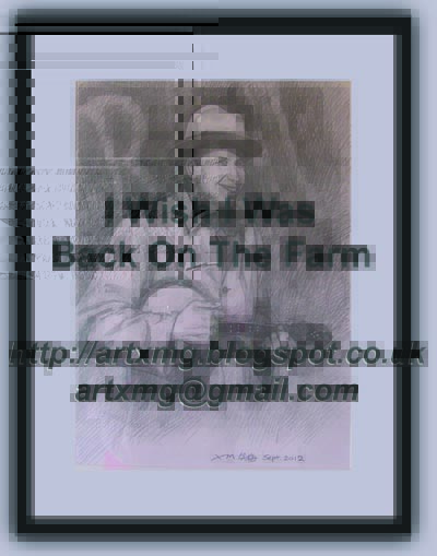
start off with an idea. In this case, I wanted to do a picture of one of my
favourite George Formby songs, 'You Don't Need a Licence For That'. Actually,
the movie in which it was performed, 'George in Civvy Street' is also one of my
favourites. I like his later movies as they seem to have a bit more about them
plot-wise, and have nicer production qualities, maybe because they had bigger
budgets.
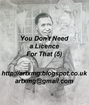
Once
I've got the idea, I look at various photographs and film stills to think about
my composition. To produce a good picture you also need to understand the
subject, so I spend some time thinking about how George performs, his posture
and mannerisms, how he holds his uke, his eyes and smile, and so on. A lot of
this may seem fine detail but it's necessary to get it right at the initial
composition and outline sketching stage.
Now
I can start working with my pencils (see the attached pictures).
(1)
I start by loosely sketching the main image - George's body - to get the
physical proportions and the stance correct. This is a quick and light sketch,
but it is important for the line to be right. I start with a 4B pencil for a
soft bold line.
(2)
Next I add some rough shading, mainly to the outlines, to give the loose sketch
more substance. I'm working from dark to light - getting the dark areas in
place first. Notice how George's face is now easily recognisable after only a
little pencil work.
(3)
Then I put in more accurate shading and layer up the darker areas. This puts
greater detail into the face and hands. I also begin to lightly sketch in the
background composition.
(4)
It's not just pencils of course. I'm also blending and blurring using a special
artist kneaded eraser or my finger, maybe to subdue areas or visually recede
them. I also build up the background detail now whilst ensuring it doesn't
distract from the main image of George. Some of the background is very abstract
or hardly discernable. Other parts however are more detailed, like the pub sign
which I feel is an important part of the picture's narrative. I had to give a
lot of consideration to its positioning as whilst it is important, it is there
to complement George and not to take the eye away from him.
(5)
Nearly finished, and I tidy up the final light and shading effects, and think
about the shadowing, in the pockets of his jacket for example. I'm using harder
pencils now but rarely harder than a 2B. This is a difficult time really as I
need to know when to stop - there's always the temptation to do just one more little
thing and before you know it the picture becomes overworked and looses its
natural energy.
(6) Finally the finished picture can be signed!